Ten-minute analysis
I stumbled across a data source listing the value of 1 bitcoin (in USD) on a daily basis for the past year. The full link to the data file is here, but for convenience I created a shorter URL: bit.ly/btchist.
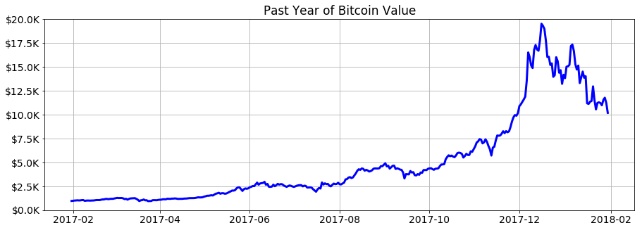
As of today (February 1, 2018), the past year looks like this:
I spent a few minutes playing around with this little data set today. Somehow I doubt that any advanced statistical or machine learning techniques would have been very successful at foreseeing the wild (and temporary?) spike in BTC value in December 2017, so I thought I’d just have some fun with very basic models, quadratic and exponential.
Limiting myself to the first 300 days of data (up to around November 25 or so), I built hundreds of quadratic models and graphed them all at once:

Notice the cluster of similar results, where the vast majority of models predict a value of around $10K in February and March. According to these, the value shouldn’t have approached $20K until some time in the second half of 2018.
Repeating the above with exponential functions as models, the results are a bit more variable and generally more optimistic:

Code
# Data importing, manipulating, and graphing
import pandas as pd
import matplotlib.pyplot as plt
from matplotlib.dates import date2num, num2date

# Curve fitting
from numpy import polyfit, polyval, exp, array
from scipy.optimize import curve_fit, OptimizeWarning

# Ignore exponential fitting difficulties
from warnings import filterwarnings
filterwarnings('ignore', category = OptimizeWarning)

# Plot settings
%matplotlib inline
plt.rcParams['figure.figsize'] = 15, 5
plt.rcParams['font.size'] = 14

# Get the last year of bitcoin price data
df = pd.read_csv('http://bit.ly/btchist',
                 header = None, names = ['DATE', 'USD'],
                 parse_dates = ['DATE'])

# Create a generic exponential function for fitting
mindate = df.DATE.apply(date2num).min()
def func(x, a, b, c):
    x_ = array([(t - mindate)/365.0 for t in x])
    return a * exp(b * x_) + c

# Prepare for plotting
x = [date2num(t) for t in df.DATE]
x = range(int(min(x)), int(max(x)) + 90) # Extrapolate 90 days
dt = [num2date(t) for t in x]
fig1, ax1 = plt.subplots()    # For quadratic models
fig2, ax2 = plt.subplots()    # For exponential models

# Find models using first 3, 4, 5, ... up to 299 days of data
for days in range(3, 300):
    # Get and plot a quadratic fit
    p = polyfit(x[:days], df.USD[:days], 2)
    ax1.plot(dt, polyval(p, x),
             lw = 15, c = 'red', alpha = .01)
    try:
        # Get and plot an exponential fit (if possible)
        p, _ = curve_fit(func, x[:days], df.USD[:days],
                         p0 = [100, .01, 100])
        ax2.plot(dt, func(x, p[0], p[1], p[2]),
                          lw = 15, c = 'red', alpha = .01)
    except:
        pass

# Pretty up the graphs
ax1.set_title('Quadratic Models for Bitcoin Value')
ax2.set_title('Exponential Models for Bitcoin Value')
for ax in [ax1, ax2]:
    ax.plot(df.DATE, df.USD, lw = 3, zorder = 9001, c = 'blue')
    ax.set_ylim([0, 20000])
    ax.set_yticklabels(['$%.1fK' % (v/1000) for v in ax.get_yticks()])
    ax.grid()
Update: one month later
After posting what’s above, I adjusted my code a little so that whenever I run it, a local copy of the bitcoin value history data is accessed, augmented by any new data available, and saved. One month has passed since then, and bitcoin value has seemingly begun to stabilize itself within the main range of my hastily-constructed projections:

The dotted vertical line indicates the limit of the data used to create the models.
